Adhering to certain rules of grammar and mechanics helps us keep our writing clear and consistent. This section will lay out our house style, which applies to all our content unless otherwise noted. (We cover a lot of ground in this section—the search feature will help if you're looking for something in particular.)
Basics
Write for all readers. Some people will read every word you write. Others will just skim. Help everyone read better by grouping related ideas together and using descriptive titles and subtitles.
Focus your message. Create a hierarchy of information. Lead with the main point or the most important content, in sentences, paragraphs, sections and pages.
Be concise. Use short words and sentences. Avoid unnecessary modifiers.
Be specific. Avoid vague language. Cut the fluff.
Be consistent. Stick to the copy patterns and style points outlined in this guide.
Grammar guidelines
Abbreviations and acronyms
If there’s a chance your reader won’t recognise an abbreviation or acronym, spell it out the first time you mention it and specify the abbreviation or acronym in parentheses.
First use: Customer Relationship Management (CRM)
Second use: CRM
If the abbreviation or acronym is well-known and understood like HTML, it is okay to leave it as is.
Active voice
Use active voice. Avoid passive voice.
In active voice, the subject of the sentence does the action. In passive voice, the subject of the sentence has the action done to it.
Yes: Marti logged into the account.
No: The account was logged into by Marti.
Words like “was” and “by” may indicate that you’re writing in passive voice. Scan for these words and rework sentences where they appear.
One exception is when you want to specifically emphasise the action over the subject. In some cases, this is fine.
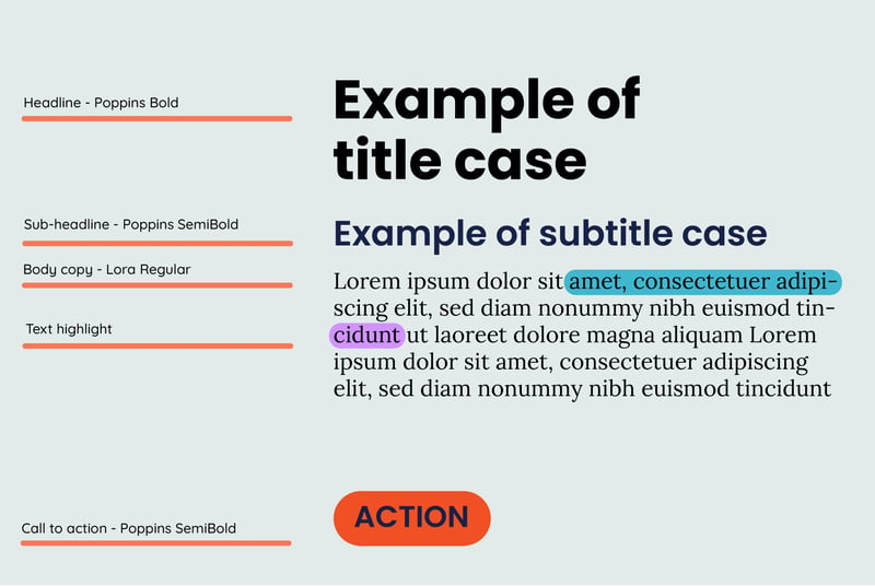
Capitalisation
For titles, subtitles and all other heading types we use sentence case. In sentence case you capitalise the first word.
Example
The best ways to grow your tech business overseas
The only exceptions to this rule are for proper nouns (names), colons or numerical titles.
Example: Title with proper noun
The best way to grow your tech business overseas using HubSpot
Or
Example: Title with colon
Using HubSpot for lead gen: How to grow your Kiwi tech business overseas
Or
Example: Numerals in titles
6 Ways to grow your tech business overseas
Numbers
Spell out a number when it begins a sentence, unless it is a title of some kind. Any number under 10 should be spelled out at any time.
In text numeral examples:
Ten new employees started on Monday, and 12 start next week.
I ate three doughnuts at coffee hour.
Meg won first place in last year’s cycling contest.
We hosted a group of 15-year-olds who're learning to code.
Sometimes it feels weird to use the numeral. If it's an expression that typically uses spelled-out numbers, leave them that way.
Examples:
A friendly welcome email can help you make a great first impression.
That is a third-party integration.
Put your best foot forward with the all-in-one marketing platform that grows with you.
After you send your newsletter, Freddie will give you a high-five.
Numbers over 3 digits get commas:
999
1,000
150,000
Write out big numbers in full. Abbreviate them if there are space restraints, as in a tweet or a chart: 1k, 150k.
Dates
Generally, spell out the day of the week and the month. Abbreviate only if space is an issue.
Saturday, January 24
Sat., Jan. 24
Decimals and fractions
Spell out fractions.
Yes: two-thirds
No: 2/3
Use decimal points when a number can’t be easily written out as a fraction, like 1.375 or 47.2.
Percentages
Use the % symbol instead of spelling out "percent" unless the word percent is spoking within quotation marks e.g., "We saw a 22 percent turnaround in our sales lead generation efforts."
Ranges and spans
Use a hyphen (-) to indicate a range or span of numbers.
Example
It takes 20-30 days.
Money
When writing about currency, use the appropriate country currency symbol before the amount e.g., $20.00. For currency symbols used by multiple countries make sure the country currency code is in front of the symbol e.g., USD $70.00.
Telephone numbers
Use dashes without spaces between numbers. Use a country code if your reader is in another country.
06-751-9045
+64-06-751-099045
Temperature
Use the degree symbol and the capital C abbreviation for Celsius.
Example
Yes: 28°C
No: Twenty-eight degrees Celsius
Dates and Time
Use numerals and am or pm, with a space in between. Don’t use minutes for on-the-hour time.
7 am
7:30 pm
Use an En Dash (–) between times to indicate a time period.
7 am–10:30 pm
Specify time zones when writing about an event or something else people would need to schedule.
When referring to international time zones, spell them out following our abbreviations and acronyms guidelines.
Example
First use: New Zealand Standard Time (NZST)
Second use: NZST
Abbreviate decades when referring to those within the past 100 years.
the 00s
the 90s
When referring to decades more than 100 years ago, be more specific:
the 1900s
the 1890s
Punctuation
Apostrophes
The apostrophe’s most common use is making a word possessive. If the word already ends in an s and it’s singular, you also add an ’s. If the word ends in an s and is plural, just add an apostrophe.
The doughnut thief ate Sam’s doughnut.
The doughnut thief ate Chris’s doughnut.
The doughnut thief ate the managers’ doughnuts.
Apostrophes can also be used to denote that you’ve dropped some letters from a word, usually for humour or emphasis. This is fine but do it sparingly.
Colons
Use a colon to join 2 related phrases. If a complete sentence follows the colon, capitalise the 1st word.
I was faced with a dilemma: I wanted a doughnut, but I’d just eaten a bagel.
Commas
When writing a list, avoid using the Oxford comma.
Yes: David admires his parents, Oprah and Justin Timberlake.
No: David admires his parents, Oprah, and Justin Timberlake.
Otherwise, use common sense. If you’re unsure, read the sentence out loud. Where you find yourself taking a breath, use a comma.
Dashes and hyphens
Use a hyphen (-) without spaces on either side to link words into single phrase, or to indicate a span or range.
Examples:
first-time user
Monday-Friday
Use an Em Dash (—) without spaces on either side to offset an aside. Make sure you use a true Em Dash, not hyphens (- or --).
Yes: Multivariate testing—just one of our new Pro features—can help you grow your business.
Austin thought Brad was the doughnut thief, but he was wrong—it was Lain.
No: Multivariate testing -- just one of our new Pro features -- can help you grow your business.
Austin thought Brad was the doughnut thief, but he was wrong - it was Lain.
Ellipses
Ellipses (...) can be used to indicate that you’re trailing off before the end of a thought. Use them sparingly. Don’t use them for emphasis or drama, and don’t use them in titles or headers.
“Where did all those doughnuts go?” Christy asked. Lain said, “I don't know...”
Ellipses, in brackets, can also be used to show that you're omitting words in a quote.
“When in the course of human events it becomes necessary for one people to dissolve the political bands which have connected them with another and to assume among the powers of the earth, [...] a decent respect to the opinions of mankind requires that they should declare the causes which impel them to the separation.”
Full stops
Full stops go inside quotation marks. They go outside parentheses when the parenthetical is part of a larger sentence, and inside parentheses when the parenthetical stands alone.
Christy said, “I ate a doughnut.”
I ate a doughnut (and I ate a bagel, too).
I ate a doughnut and a bagel. (The doughnut was Sam’s.)
Leave a single space between sentences.
Question marks
Question marks go inside quotation marks if they’re part of the quote. Like periods, they go outside parentheses when the parenthetical is part of a larger sentence, and inside parentheses when the parenthetical stands alone.
Exclamation points
Use exclamation points sparingly. They’re like high-fives: A well-timed one is great, but too many can be annoying.
Exclamation points go inside quotation marks. Like periods and question marks, they go outside parentheses when the parenthetical is part of a larger sentence, and inside parentheses when the parenthetical stands alone.
Quotation marks
Use quotes to refer to words and letters, titles of short works (like articles and poems) and direct quotations.
Periods and commas go within quotation marks. Question marks within quotes follow logic—if the question mark is part of the quotation, it goes within. If you’re asking a question that ends with a quote, it goes outside the quote.
Use single quotation marks for quotes within quotes.
Who was it that said, “A fool and his doughnut are easily parted”?
Brad said, “A wise man once told me, ‘A fool and his doughnut are easily parted.’”
Semicolons
Go easy on semicolons. They usually support long, complicated sentences that could easily be simplified. Try an em dash (—) instead, or simply start a new sentence.
Ampersands
Don't use ampersands unless one is part of a company or brand name e.g., Ben & Jerry's.
Quotes
When quoting someone in a blog post or other publication, use the present tense.
“Using HubSpot has helped our business to grow,” says Jamie Smith.
Names and titles
The first time you mention a person in writing, refer to them by their first and last names and include their position and company. On all other mentions, refer to them by their first name.
Capitalise individual job titles when referencing to a specific role. Don't capitalise when referring to the role in general terms.
Yes: Mary Sue Tompkins, Marketing Manager, HubSpot.
Yes: Mary Sue, the Marketing Manager at HubSpot.
No: Being the Marketing Manager had its perks.
On first mention, write out New Zealand. On subsequent mentions, NZ is fine. The same rule applies to any other country or federation with a common abbreviation (European Union, EU; United Kingdom, UK).
URLs and websites
Capitalise the names of websites and web publications. Don’t italicise.
Avoid spelling out URLs, but when you need to, leave off the http://www.
Slang and jargon
Write in plain English. If you need to use a technical term, briefly define it so everyone can understand.
Text formatting
Use italics to indicate the title of a long work (like a eBook, white paper or blog) or to emphasise a word.
Use italics when citing an example in step-by-step instructions: When you're all done, click Send.
Left-align text, never centre or right-aligned.
Leave one space between sentences, never 2.
Write positively
Use positive language rather than negative language. One way to detect negative language is to look for words like “can’t,” “don’t,” etc.
Yes: To get a doughnut, stand in line.
No: You can’t get a donut if you don’t stand in line.


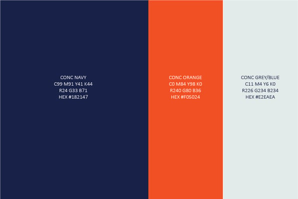
 Primary logo colourways
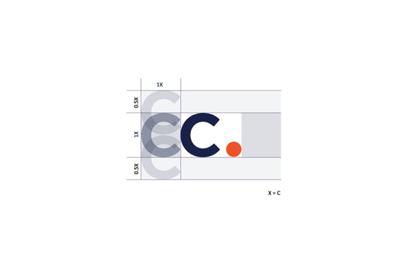
 To ensure visibility, if the primary logo will appear at less than 20 px high or 20 mm high, use the secondary logo type instead.