.png?width=778&height=407&name=Untitled%20design%20(55).png)
What are the best new Zealand tech companies doing?
For a B2B tech business, a website is the central hub for B2B lead generation. It's how you help prospective customers with their buying process and introduce your solutions, your brand and your team to potential customers.
A B2B website plays a vital role in generating leads and then nurturing them at different stages of the sales process, which is why it's essential that it ticks several crucial boxes. It's important to remember that it's not just about aesthetics - you can have one of the best-looking websites on the internet, but if it lacks the 'muscle' and doesn't work as essentially another member of your sales team, it's not going to be the lead gen machine you need it to be. What it comes down to is functionality and workability.
Why isn't your website generating leads?
To put it into perspective, a B2B tech website should be converting on average between 1-3% of visitors into leads. If the role of your website is to market your tech business and its solutions and services to prospects and convert them into leads, why aren’t these visitors and conversions happening in sufficient volume for your company?
You've fallen into the 'brochure site' trap
This is what happens when a business gets too focused on slick website design. All the effort goes into aesthetics... and then it just sits there, like a printed brochure that never changes. Your website should have the exact opposite effect; it should be continually dynamic. An effective website acts like another member of your team, engaging with interested parties and helping them understand how your solutions could work for them.
Mobile unfriendly
It's a table stake that your website can be easily displayed and navigated on a mobile device. Smartphones and tablets are becoming increasingly prolific, and pretty much everyone in the tech industry will be using them to browse the internet, create and build relationships - and do their buying. If your website doesn't function properly on a mobile device, not only will you create a frustrating experience for potential customers, but it has the potential to negatively impact your Google rankings (organic and paid) as well.
(Pro tip: use Google’s Mobile-Friendly Test tool to see how your website is performing.)
A digital jungle
There's nothing more frustrating than landing on a website and then having to go through a series of clicks to find what it is the business actually does. If potential customers can't see at a glance who you are, what you do and how you got there, they'll click away in search of one that does tick those boxes. At a minimum, your Solutions, About Us and Contact Us pages need to be only one click away and easy to read. Ideally, your homepage will convey to a visitor everything they need to know, at least at a high level.
Not ‘dressed for success’
We've emphasised that design is not the be-all and end-all, but aesthetics are still important. If your site looks clunky, outdated, too busy or is difficult to read, potential customers won't stick around for long. For any B2B business in the tech industry, having a modern-looking site is crucial, because it's a reflection of who you are. Would you buy a cutting-edge tech solution from a business that looked old-fashioned?
Lack of offers
If you never ask your website visitors to become leads, you can’t convert them to leads. That’s why you need calls-to-action (CTAs) all over your site. A CTA is often a button or link that asks the reader to do something, like download a resource, request a quote, book a demo or just get in touch. CTAs should address the content they're surrounded by as well as the stage of the buyer’s journey that your potential lead is in. Remember that the majority of your visitors are not ready to contact your sales team, but they might be interested in an eBook with more information on the solution they're researching.
Not optimised for search engines
The first place everyone goes to find a solution is Google – even in the B2B space. That's why getting your search engine optimisation (SEO) right is critical. Google needs to know about you. Not using relevant, high-volume keywords throughout your website, not structuring your website content into topics/subtopics or keyword stuffing are just a few ways you might be going wrong with your SEO strategy and as a result, losing traffic to your competitors.
B2B websites aren't set-and-forget. They need to be dynamic and continually updated. Above are some of the main challenges B2B websites face when generating leads, but they're not the only ones. Are you making any of these website mistakes too?
Best New Zealand tech B2B website designs for lead generation: Our top 10 picks
What does a successful B2B website look like? Which New Zealand tech businesses have got their websites humming with potential leads? Here are ten of our favourites (in no particular order) - and because we're not averse to tooting our own horn, we're including some that were built right here at Concentrate.
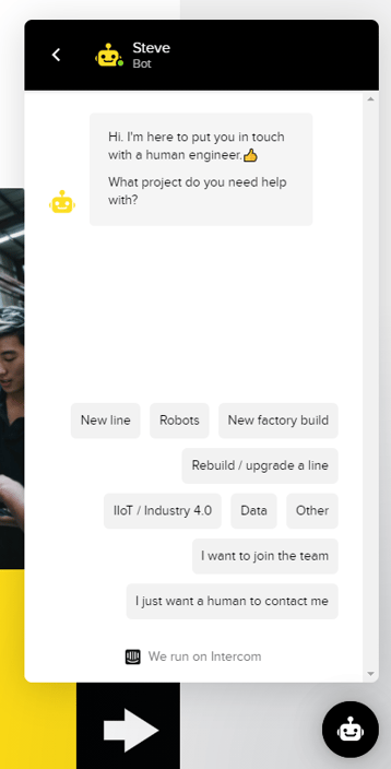
1. Facteon
These guys design and build factory solutions, and they have a very well-put-together website. What we really like about it, though, is the chatbot, 'Steve'. He's pretty robust and superior when it comes to converting leads. As soon as a visitor arrives on the website, they're prompted to select what project they need help with a range of options, including “I just want a human to contact me”. This speeds up the buyer's journey significantly, as well as giving Facteon more data on their website visitors and what they are looking for.
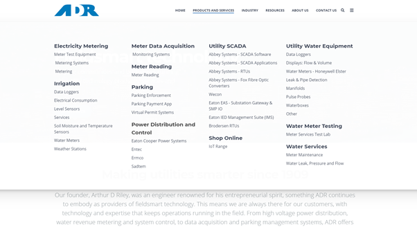
2. ADR
This is one of ours. Arthur D. Riley are providers of field-smart technology, and because they offer a very broad range of products and services over a variety of industries, which they manage by offering a 'mega-menu'. We've made it easy for visitors to identify themselves and find the product or service they need. The Products & Services menu drops down to instantly display the different categories, so visitors can see at a glance what's on offer.
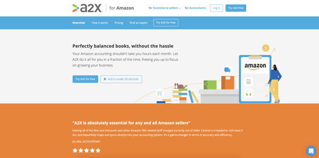
3. A2X
This company offers ecommerce accounting solutions. It's a friendly-looking website with a simplified design and an easy-to-use navigation menu. Visitors are given the option to choose “A2X for ___” with a dropdown menu to identify themselves and the ecommerce company they sell through, e.g. Walmart, Amazon, etc. Once a visitor selects an option, an entirely new secondary navigation menu is displayed with relevant and personalised content. It's a great example of why keeping it simple can be so effective.
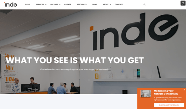
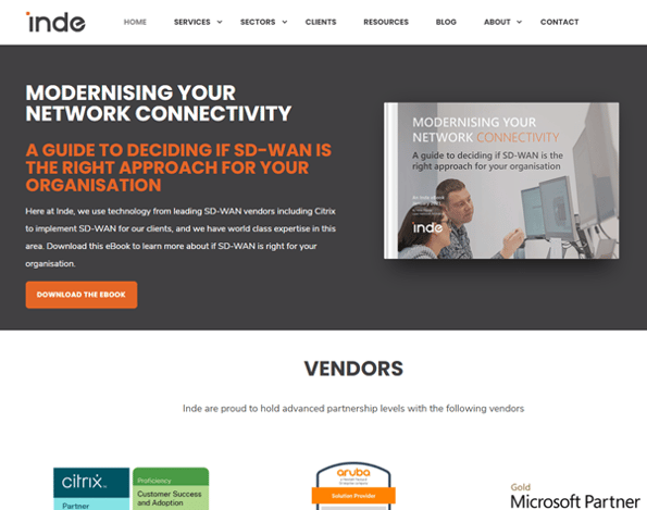
4. Inde
A fast-growing IT services company, Inde consults with New Zealand’s largest enterprises to lower their technology risk. It’s another Concentrate-built site, which includes effective engagement features like pop-up forms promoting their recent content on high intent pages, as well as a content promotion slice that's highly visible in the centre of the homepage. Taking advantage of your premium real estate (aka your homepage) is key. This is a good example of a website with prominent CTAs.
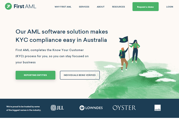
5. First AML
This outfit offers a Know Your Customer (KYC) software solution, helping keep financial institutions KYC compliant. This is another good example of a site with a variety of CTAs. They're set up to be available depending on what stage a visitor is at in the buyer’s journey, such as the hero slice: 'Reporting entities' and 'individuals being verified'. Their 'Request a demo' CTA is prominent, sticking out from the rest of the navigation menu.
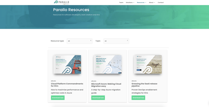
6. Parallo
Parallo is a highly technical business that offers resources for software developers, SaaS creators and ISVs. We didn't build their whole website, but we did put together their Resource Centre. It has a simple layout, is easy to navigate, with handy filtering capabilities. There’s an abundance of content to convert website visitors to leads, brand validation through case studies, and blogs for every point in the buyer's journey.
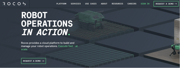
7. ROCOS
They're providers of a cloud platform that builds and manages robot operations. We really like their super in-depth homepage - there's a total of 658 total words on their homepage alone to support SEO efforts - and the way it drives visitors through their funnel:
In just a few words, the Hero slice describes exactly who ROCOS is and what they do, as well as a CTA to convert visitors.
The remainder of the homepage flows through the buyer’s journey flawlessly. Here’s a quick breakdown but we recommend checking it out for yourself too:
- Slice 2 - benefits and brand validation
- Slice 3 - further brand validation with testimonials from large corporations around the world
- Slice 4 - all the features and further benefits
- Slices 5-7 - focusing on converting the visitors with content and strategically placed CTAs to request a demo.
.png?width=750&name=Concentrate%20blog%20CTA%20(2).png)
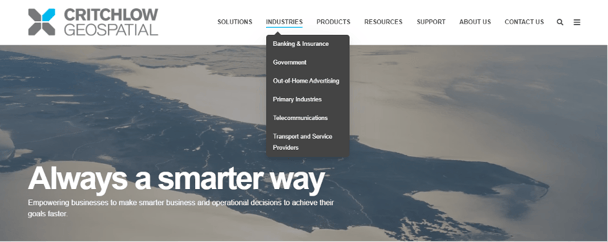
8. Critchlow Geospatial
Another Concentrate-built website, Critchlow Geospatial offers a simple layout menu that touches every stage of the funnel: Top of the funnel (industries), Middle of the funnel (Solutions) and Bottom of the funnel (Products). It means that every visitor to their site can see at a glance who they are and what they do, without enduring a complicated navigation menu.
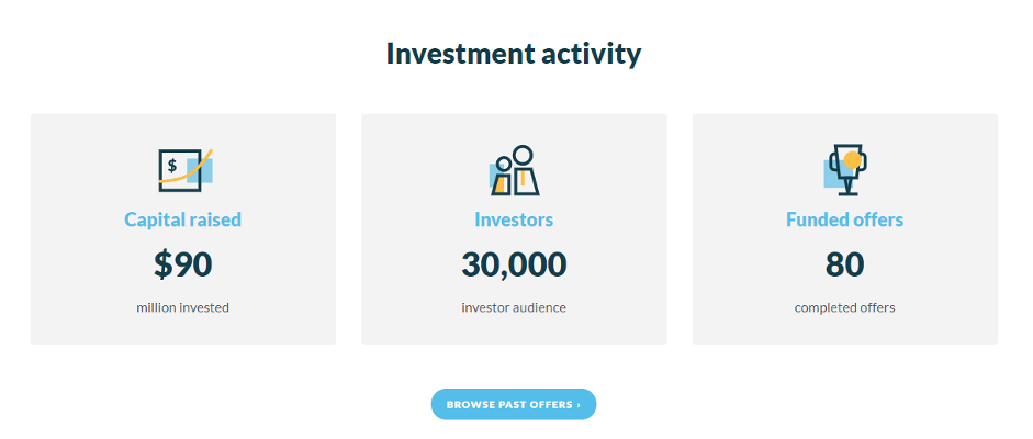
9. Snowball Effect
Snowball Effect works with other businesses throughout their growth cycles, as well as simplifying online direct investment. Their website is a great example of brand validation; their hero image offers case studies, and the first slices 'For Investors' and 'Raising Capital' talks to their two personas directly.
Hero images supporting brand validation efforts:
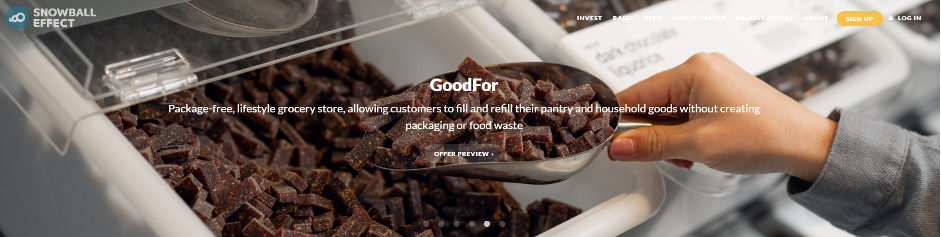
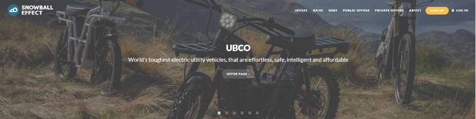
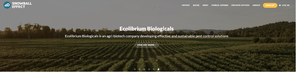
Persona slice:

This makes it easier to navigate the website, and simple for buyers to identify themselves and find the information they need. This reduces friction and speeds up the buyers’ journey. They further back up their work with the 'Investment activity' stats slice, which highlights capital raised, investors, and funded offers.
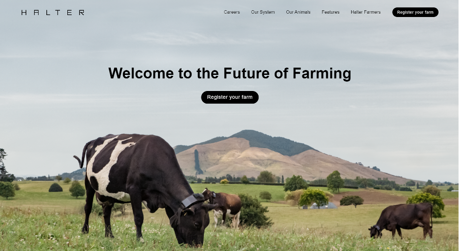
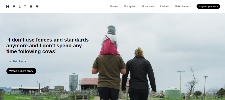
10. Halter
Proof that farming is becoming increasingly technology-focussed, Halter offers a solar-powered collar and mobile app to manage cows. We like their clear value proposition, large photos, engaging gifs to display product features, and lots of whitespace. We're also impressed with their numerous CTAs to convert website visitors and register their farms. They also have great brand validation with the 'We've featured in' slice and the high quality case study videos.
These businesses all display the qualities needed for a successful B2B website. They get the concept of the site being another member of the sales team and a crucial one at that. They're focussed on engaging visitors the moment they land on the site, as well as making their online location a pleasant place to be. They get their message across and ensure that who they are and what they do is clearly visible.
Learn more about best practice design for generating leads, and how Concentrate can keep your website working 24/7 to achieve it.
Share this
-1.png?width=5500&height=4000&name=Concentrate%20-%20Blog%20Hero%20Images%20(5)-1.png)
Is your website a marketing cost or a lead-gen asset?

Guide to distributing B2B content